
Project Overview
The Slate POS billing app automates retail or restaurant businesses. This intuitive Point of Sale App (POS), which does not require any technical knowledge, allows you to generate GST/VAT invoices for your customers with just a few taps. The Slate POS software is designed to manage all business activities, including billing, accounting, inventory, order management, and scheduled orders, from a single POS system.
Challenges
- The app mainly focused on low to medium retailers who were not well versed in app usage.
- Wholesaling, retailing and van sales will happen simultaneously in the same inventory.
- Invoices will be generated on mobile desktop app simultaneously.
- Bills should be able to be generated both offline and online
Starting Point
User research was the first component of this project. We clearly studied the billing issues currently faced by users. To do this, we interacted with real users and studied their physical and technical problems related to billing and inventory management. We also observed live sales of users from various types of businesses. We learned a lot from this research and made changes to the project accordingly.
- Who are the target users of this product ?
- In what areas will this product be used ?
- In what situations is this product likely to be used ?
- How the user can complete the billing very quickly
- How to make it easy to bill both offline and online simultaneously on multiple devices
The insights gained from our SME interviews were nothing short of a goldmine of understanding. Armed with this valuable knowledge, we employed the power of an affinity diagram to effortlessly sift through the data, grouping similar tasks and categorizing them based on high-level goals for achieving efficiency, improving processes, enhancing depth, and increasing familiarity. By acknowledging and addressing the potential conflicts of interest among different stakeholders, we were able to zero in on shaping user goals that aligned seamlessly with the larger business objectives.

Meet Users

- Primary
- Name: Jake
- Age: 32
- Family: Wife and 2 Kids
- Occupation: Accountant
Jake is a family man with a wife and 2 kids, he is an accountant and after finishing his job he hardly gets time to spend with his family. He wanted an easy solution to manage inventory and sales for his office. Due to this, it is expected to reduce the working time and reduce the workload

- Primary
- Name: Jason
- Age: 26
- Family: Single
- Occupation: Sales Man
Jason is a hard-working single man who lives with his parents He works as a cashier in a supermarket. It is a wholesale and retail supermarket. Billing becomes more difficult when you have to bill wholesale and retail at the same time. Jason's hope is that having a better solution to this can reduce customer frustration
Competitive Analysis
We examined several competitors, including both direct and indirect ones, reviewed the features of currently available products, and were able to identify the advantages and disadvantages of each product. While we found that the majority of features across competitors were very similar, we did observe some key differences, which included:
- Easily Accessible vs Hardly Accessible
- Too Many Screens vs Simplified Interaction
- Bright / Distracting Interface vs Minimalistic Interface
- Time taken to complete each features
Information Architecture

Lo-fi Ideation
As we worked through a few preliminary sketches, we came to the realization that some of the ideas and layouts we were considering simply wouldn't work. The process allowed us to efficiently communicate ideas that were difficult to articulate, facilitating more productive discussions and enabling us to quickly filter out both good and bad ideas.

Wireflow
After sketching out some P&P wireframes and carefully considering the preliminary flow, we reviewed what was necessary, unnecessary, and which areas required improvement. We devoted a significant amount of time to this stage to ensure that we could add the finishing touches to the underlying UX before proceeding to the visual design phase.

Billing
Users need complete the sale and generate invoice within few clicks and the navigation buttons shoud be large and more visible for all types of users.
CHALLENGE 2
Multi Device Access
A key factor is that customers use multiple devices at the same time with multiple sales channels. Inventory needs to be updated on time for all equipment without affecting sales.
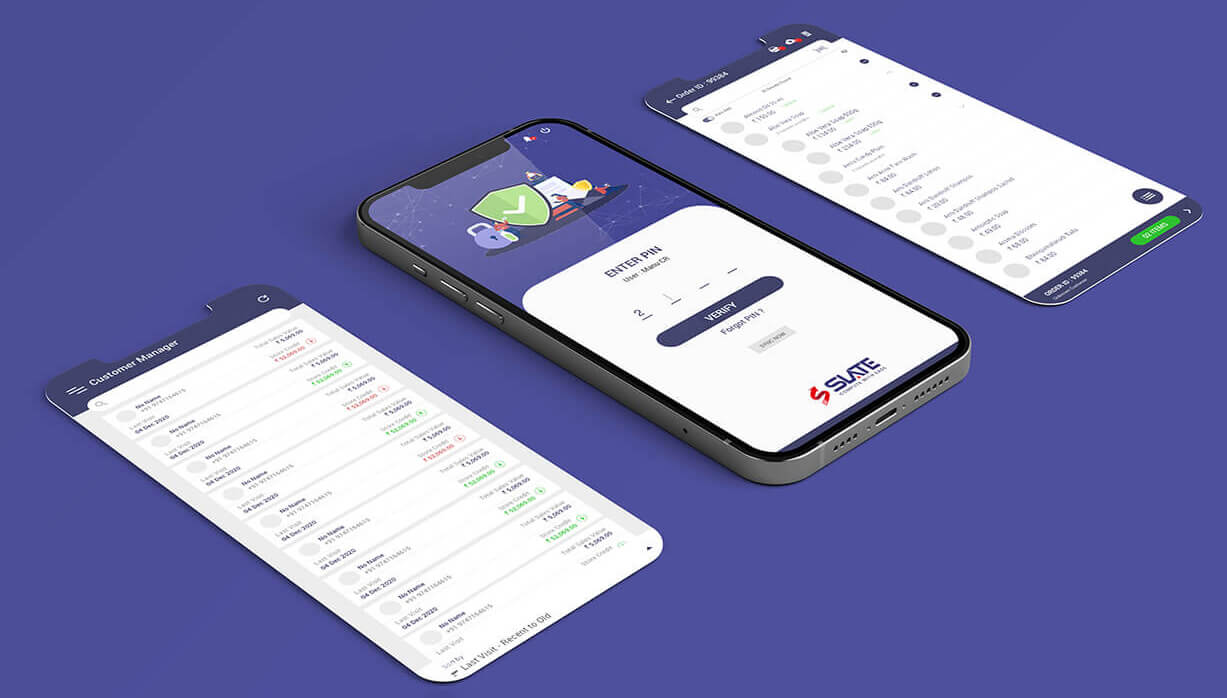
Style Guide
Navigation is clearer with fewer colors. As the user spends more time in the app, color combinations are used in a way that does not irritate the eyes

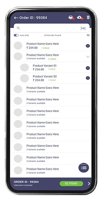
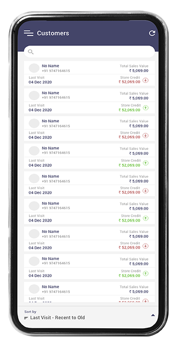
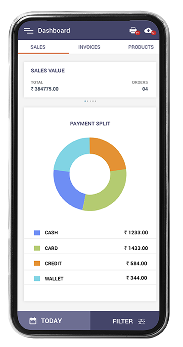
Final Prototype
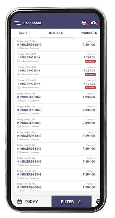
With all the high-fidelity pages designed, I built up the final prototype, a scaled-down version of the product.
Final Thoughts
By creating the final prototype, I believe I achieved the goals stated at the beginning of the design process. I added new features based on needs gathered from user interviews and integrated existing features with the existing app to create less friction.
If I had more time, I would delve deeper into the data visualization aspects of expense summarization and think again about Slate's socialization features. These features will add more features to the business and increase competitiveness.
