Project Overview
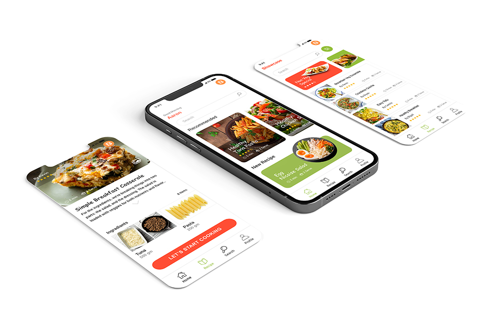
Food book app a specialized Healthy food recipe app that aims to provide quick, easy, and fun recipes for kids. It is designed to primarily help working and stay at home parents plan meals, share, and have access to delicious and healthy recipes at their fingertips.
Date: August 2022 to September 2022
Role: UX Designer
Project Goal
Design an app that will improve to learn the topic of cooking healthy food for kids. It will help to have a clear idea about cooking healthy food
Challenges
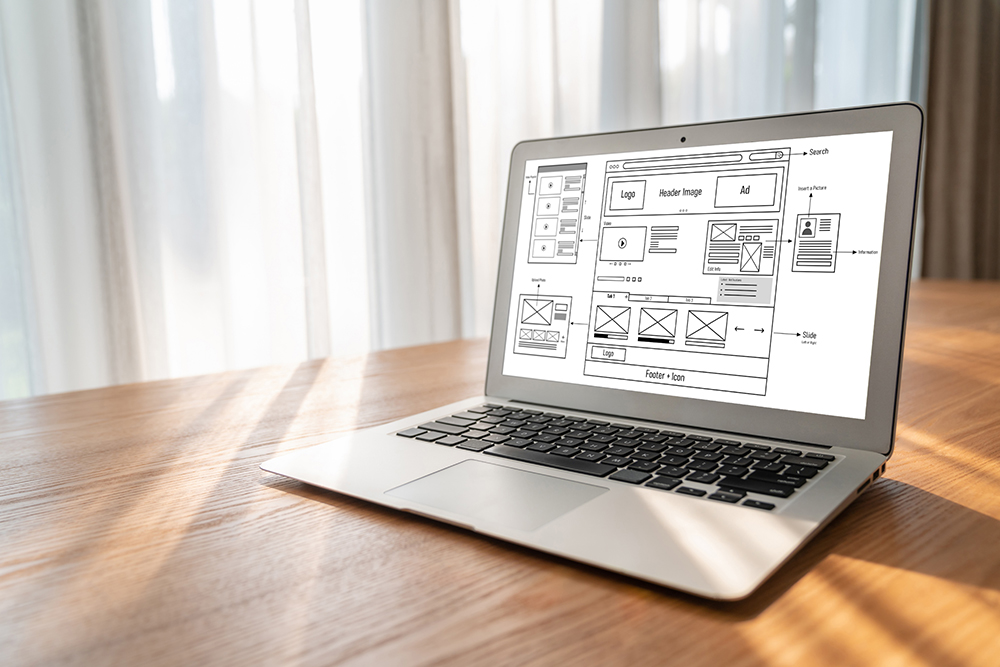
As working or stay-at-home parents don't have time to cook or even think of simple and quick recipes, they have to rely on take-out, processed or packaged food. For children with dietary restrictions or allergies, the range of possible recipes becomes even narrower.
Target Audients
Recipe app especially for kids that aims to provide quick, easy, and fun recipes. It is designed to primarily help working and stay at home parents plan meals, share, and have access to delicious and healthy recipes at their fingertips. The feedback received through research made it very clear that users easy-to-use tool to guide to cook healthy
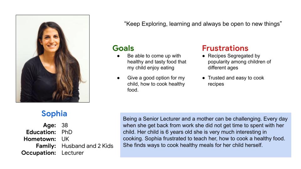
Meet the users
- Name: Sophia
- Age: 38
- Occupation: Lecturer
Being a Senior Lecturer and a mother can be challenging. Every day when she get back from work she did not get time to spent with her child. Her child is 6 years old she is very much interesting in cooking. Sophia frustrated to teach her, how to cook a healthy food. She finds ways to cook healthy meals for her child herself.
Ideation
I did a quick ideation exercise to come up with ideas for how to address gaps identified in the competitive audit. My focus was specifically for kids to cook healthy meals.
Lo-Fi Wireframe
After ideating and drafting some paper wireframes, I created the initial designs for the Foodbook app. These designs focused on delivering personalized guidance for kids to cook healthy food
To prepare for usability testing, I created a low-fidelity prototype that connected the user flow of viewing an item about to expire and using it in a recipe.
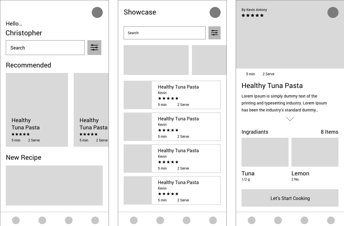
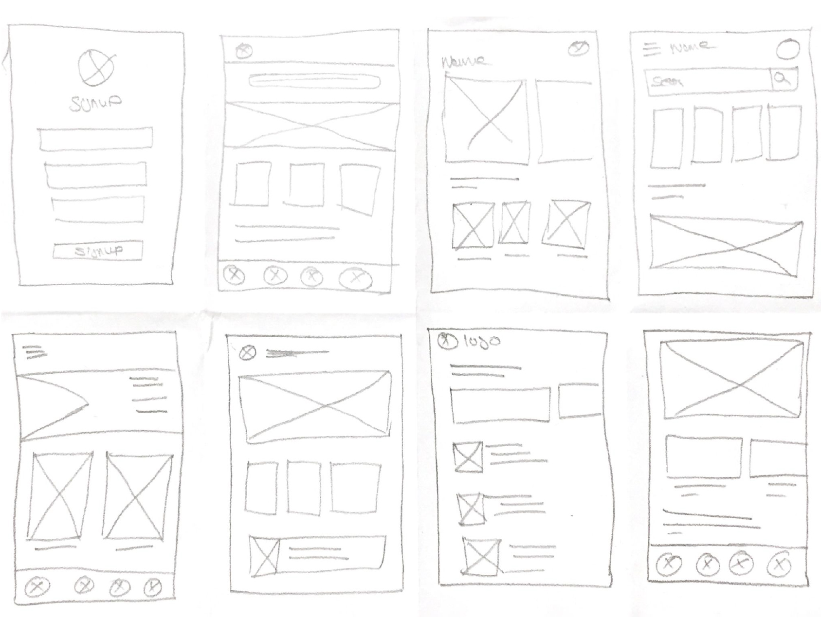
Paper Wireframe
Taking the time to draft iterations of each screen of the app on paper ensured that the elements that made it to digital wireframes would be well-suited to address user pain points.
Digital wireframes
As the initial design phase continued, I made sure to base screen designs on feedback and findings from the user research.
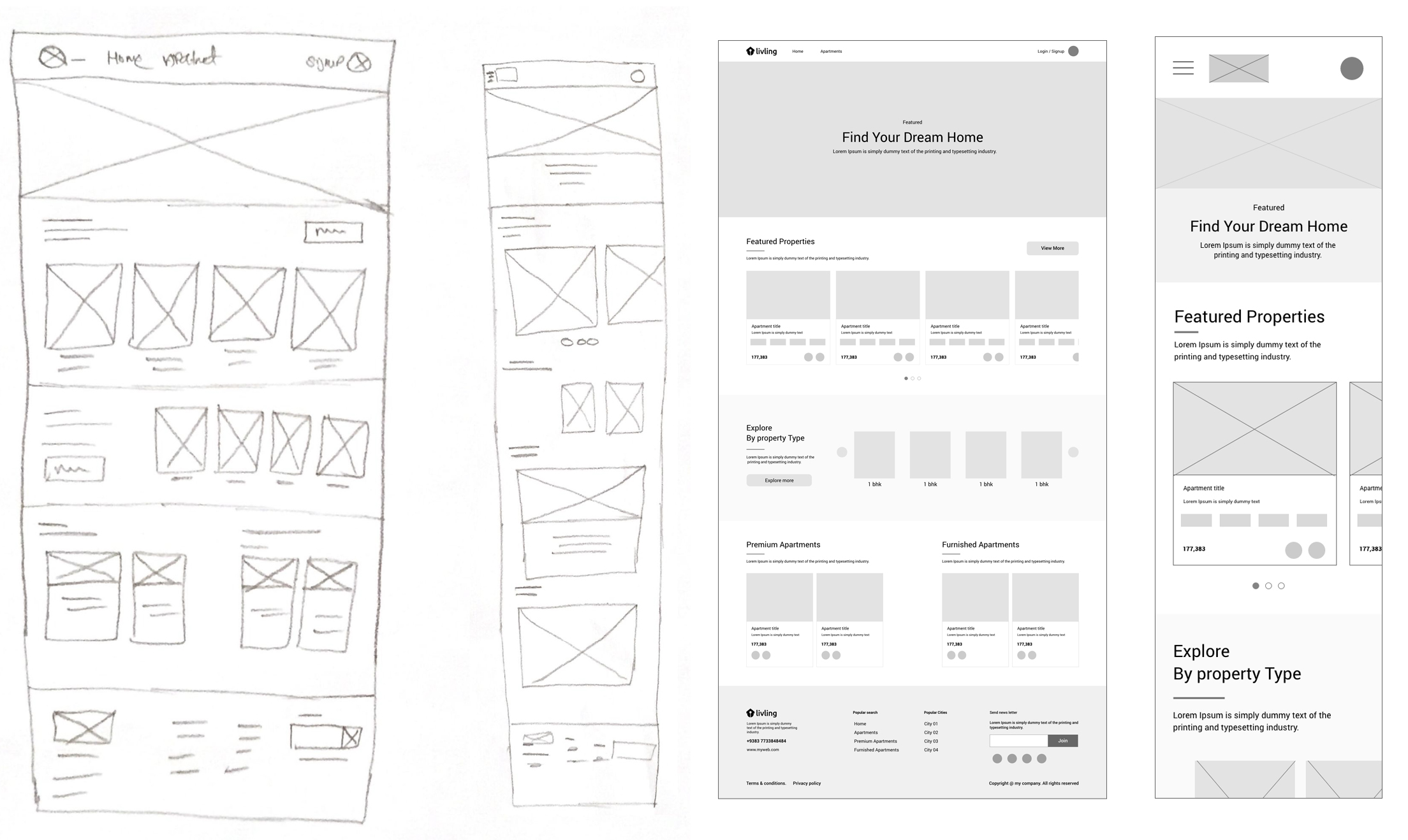
Findings After Usability Study
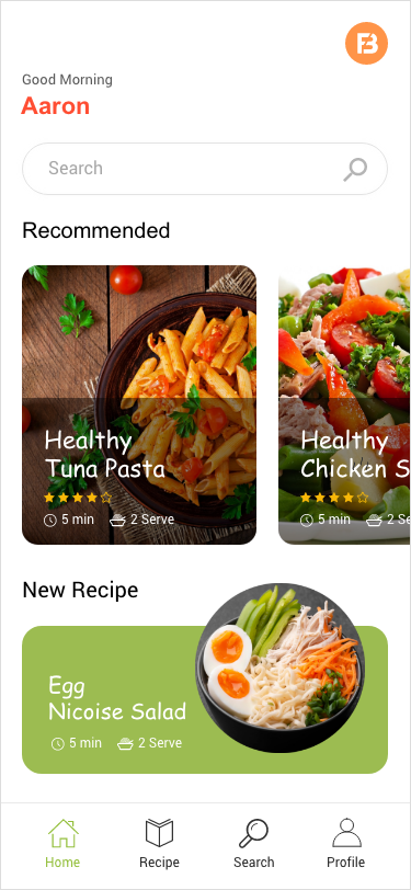
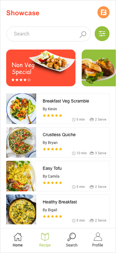
Based on the insights from the usability studies, I applied design changes like providing a clear section from the home screen to browse recipes that specifically use items available in “Food Book”.
Additional design changes included an option to filter recipes from the listing screen and users can identify the recipe based on the rating
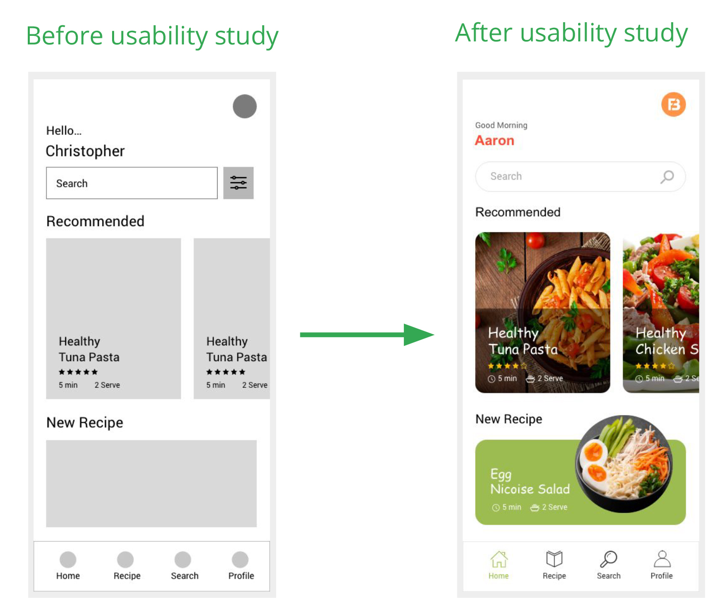
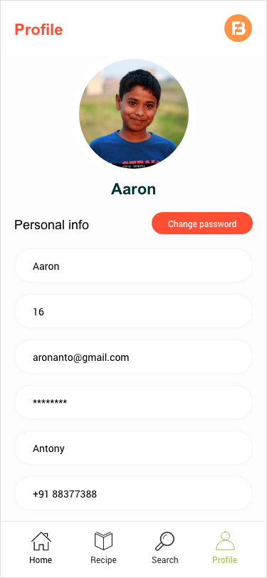
Mockup
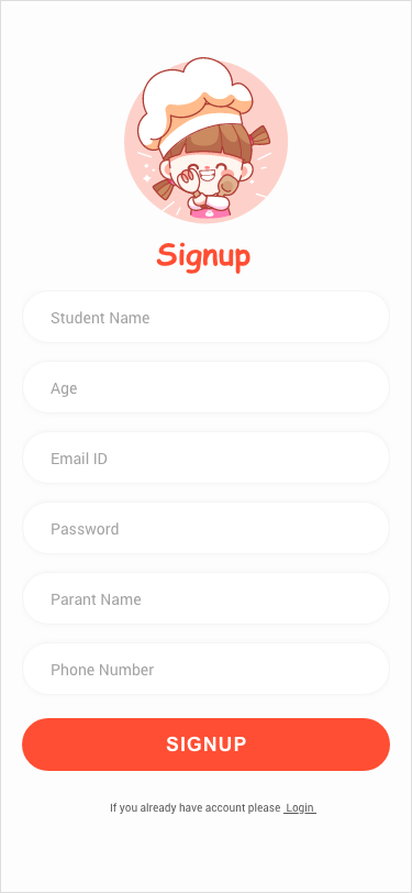
Site Map
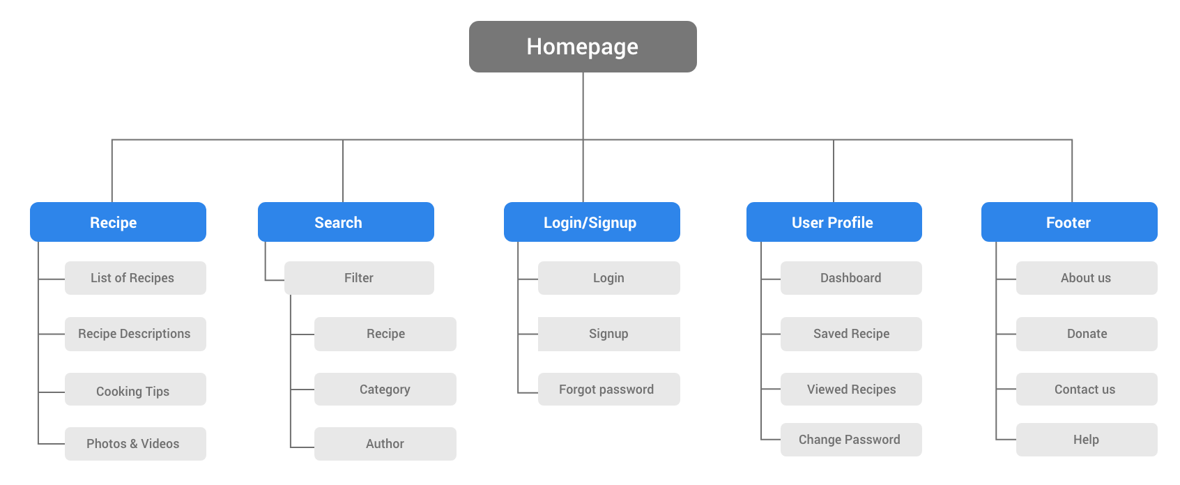
With the app designs completed, I started work on designing the responsive website. I used the Food Book sitemap to guide the organizational structure of each screen’s design to ensure a cohesive and consistent experience across devices.
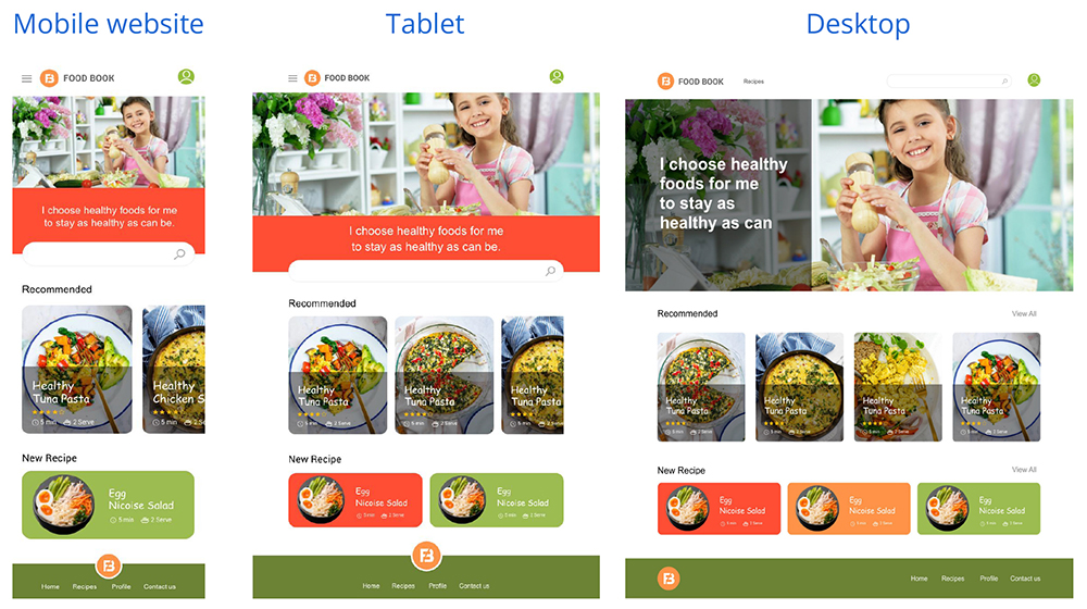
Responsive designs
The designs for screen size variation included mobile, tablet, and desktop. I optimized the designs to fit specific user needs of each device and screen size.
What I learned ?
Although the problem I was trying to solve was huge, I realized that diligently going through each step of the design process and aligning it with specific user needs helped me come up with practical and useful solutions.
What is Next?
- Conduct research on how to successful the app is in reaching the goal to increase interest in cooking in children
- Add recipes for cooking more healthy meals for kids to learn how to lead a healthy lifestyle
- Create an opportunity for children who are interested in cooking to interact with each other
