
Project Overview
Fincol is an online SaaS-based application made for small to medium business in the line of GYM, fitness centres, beauty parlours & spa, tuition & coaching centres, dance, music & drawing classes, driving schools etc where attendance registers to be maintained and fee collected regularly. The primary objectives were to design an intuitive mobile application that allows users to easily add, edit, pay fees and attend.
My Role
I was the product designer of the application from scratch, strategising, conceptualising, designing, and communicating to developers working for multiple platforms. My primary responsibilities include defining the product strategy, the vision for the product, wire framing low fidelity designs to prototyping high fidelity designs, and collaborating with product managers and developers by managing the entire design lifecycle in bringing the product to life.
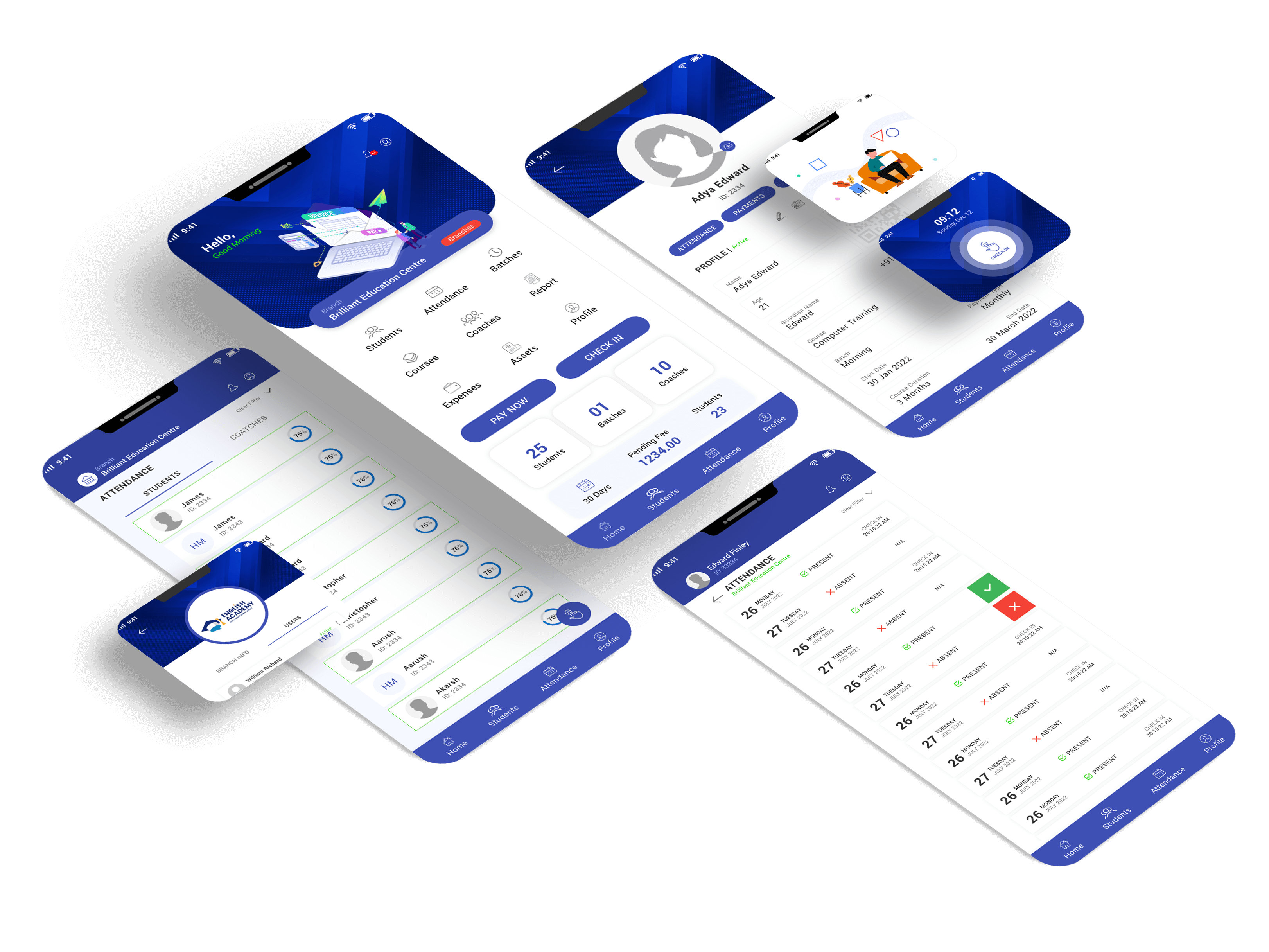
Problem: The need for the application
- Users need to use online and offline
- Users need to upload bulk data to app using mobile
- Users can manage multiple role for each employees
- Users need to download student ID card with auto generated QR
Vision and strategy
The vision was to build a simple product that can use all type of customers effortlessly. Identifying the features that users want and designing the product using agile methodology was the inherited strategy to bring out an efficient product and a usable product.
User Interviews -
Inquiring users for valuable insights
Initially, we identified and discussed business owners who manage the same category of business. From this, we were able to understand the most essential requirements of this product and learn about their diverse needs. These answers were the base to start designing features for version one.
- The common features they use ?
- Features they wanted to use in mobile app ?
- What are the tasks they do on daily basis in mobile ?
- How they collect fee and type of fee structures ?
- How is their attendance structure managed ?
Insights from the interviews
- Users want to accomplish things quickly : Users want to complete a task or a function in the minmum number of steps and time.
- Prefer a lightweight experience : No clutter and unwanted elements in the product where they can focus on what they wanted to acheive.
- Multiple Users can manage : Multiple users can manage fees and attendance with or without internet
- Reminders & Notifications : Users want to get fee pending reminders on time
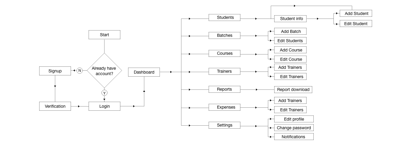
User-Flow Diagram
User experience is designed from the outline of a typical user journey based on the completion of specific tasks within the app. Once the user journey was established, we started unpacking the design flow for general and specific use cases.
Lo-fi Ideation
After identifying the basic needs of the user, key features were identified and conceptualised. Sketching helped us as we followed an agile method to quickly get an idea of how the product was going to take shape and give us a rough idea of the ideas.

Low-Fi Prototypes
Low-fidelity prototypes helped us take sketches to the next level, but high-fidelity mockups are a step ahead. Simple prototypes were very useful for identifying elements for framing the design system and getting an initial feedback from the team before focusing on the visual design, which required a larger effort.

Style Guide
It’s important to remember that color is a powerful tool for communication, and it can greatly impact the overall user experience. By considering the psychological effects of color, designers can effectively convey the desired mood and emotions, and create a more effective and enjoyable user experience.

Final Prototype
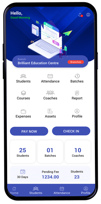
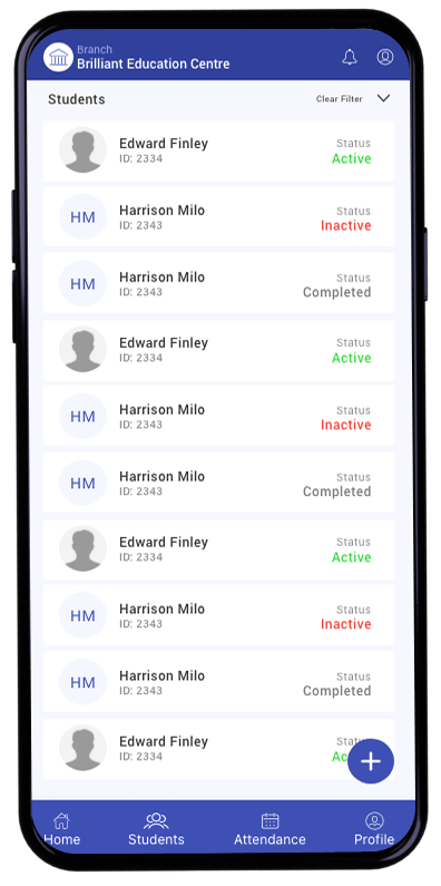
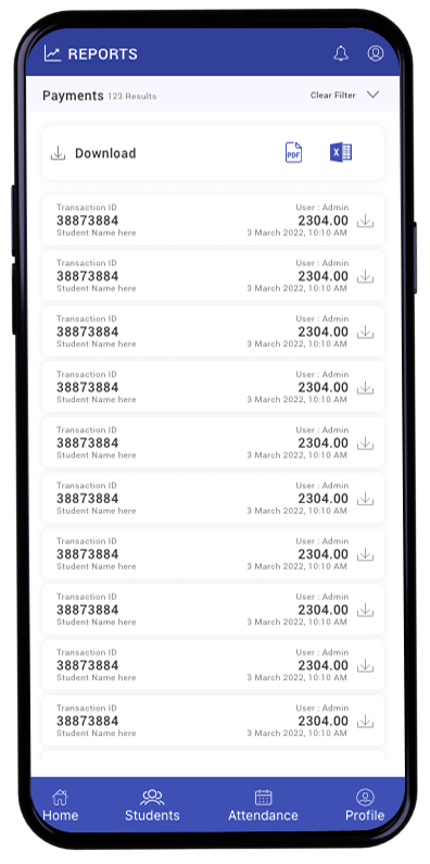
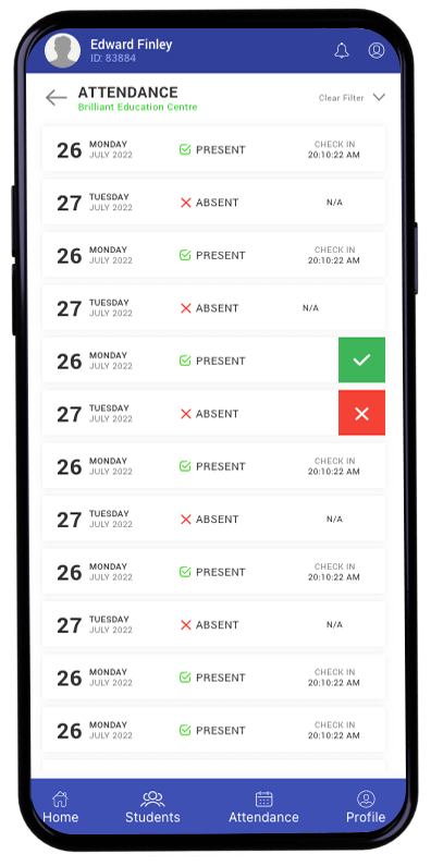
With all the high-fidelity pages designed, I built up the final prototype, a scaled-down version of the product. That allows to test and validate your design decisions. A scaled-down version of the product, also known as a minimal viable product (MVP), can help to gather feedback and make adjustments before investing significant time and resources into development.
Reflection
Designing an end to end experience with all the necessary applications was a huge challenge in a timebound project. Designing for multiple platforms and multiple form factors at once made me a fast paced person. Got to learn the importance of visual design and visual hierarchy and how it makes the users more engaging. Although we ideated on multiple solutions, all we could build was some minimum viable product within the given time period and resources yet a useful one.
