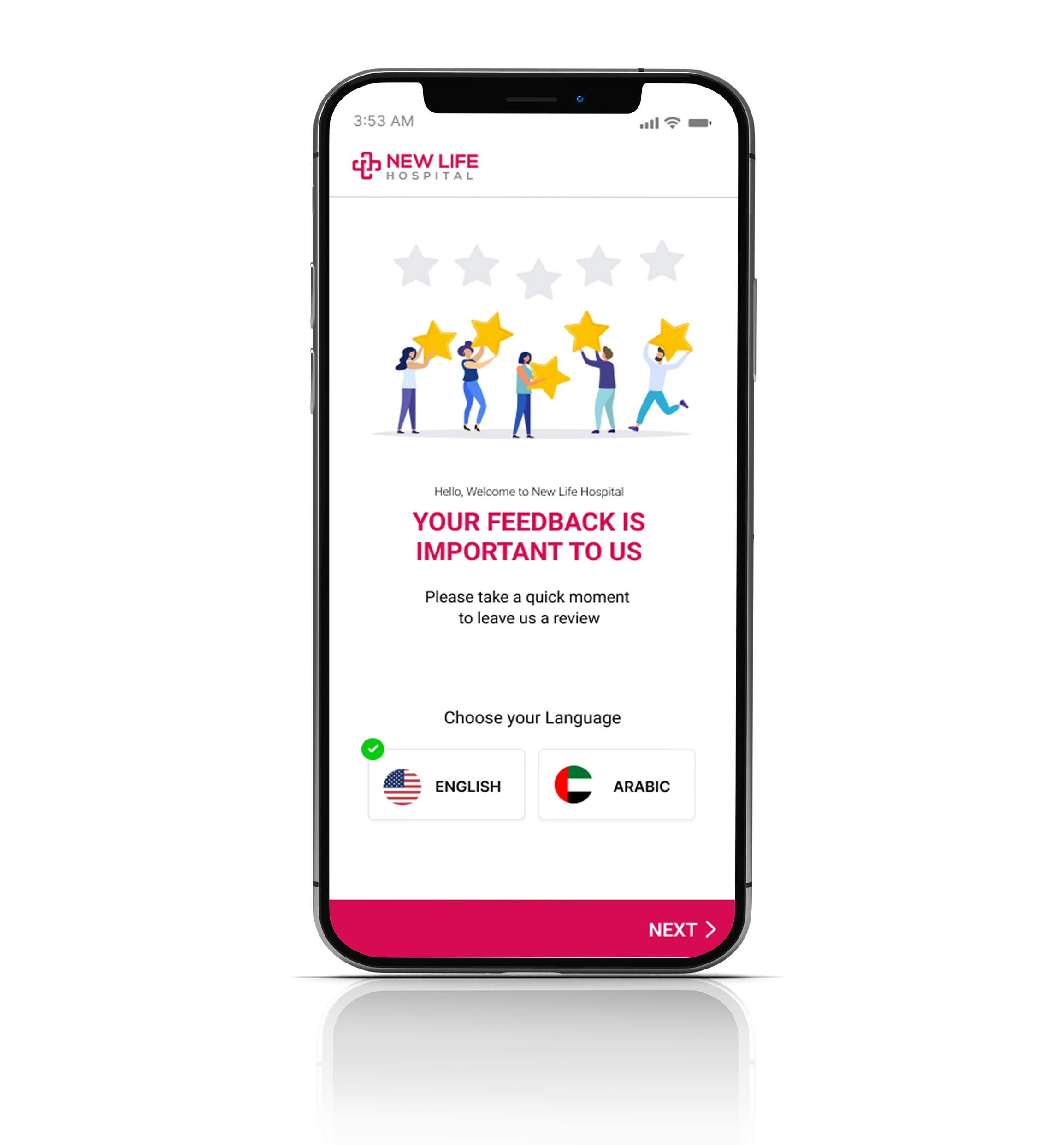
Project Overview
New life hospital is a multi speciality premium hospital in the city. New life hospital struggle to get feedback from their customers. They are seriously focused on quality care. Now they are using manual method using paper. The want to create a simple and user friendly app for their customers to send feedback easily.
Date: August 2022 to September 2022
Role: UX Designer
Project Goal
New life hospital allows patients can easily send their experience about the services received from the hospital using the Hospital feedback app

Responsibilities
Conducting interviews, paper and digital wireframing, low and high-fidelity prototyping, conducting usability studies, accounting for accessibility, and iterating on designs.
Target Audients
Patients of all types who have experience with hospital facilities and services can send feedback on their experience and suggestions.
Challenges
1. The patients are not willing to write feedback using paper template
2. The user cannot easily analyse the feedback based on the requirement, it is too much time consuming
3. The user check paper feedback manually and create the feedback report in the google sheet
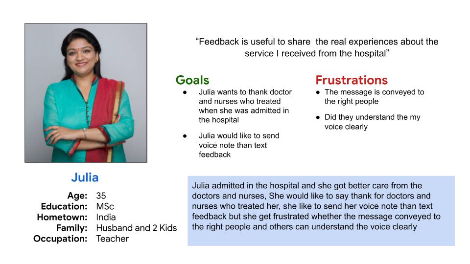
Meet the users
- Name: Julia
- Age: 35
- Occupation: Teacher
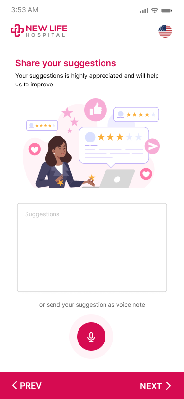
Julia is a teacher she wants to thank doctor and nurses who treated when she was admitted in the hospital. Julia would like to send voice note than text feedback
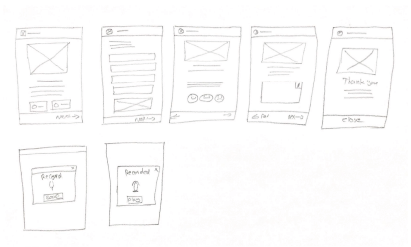
Paper Wireframe
Taking the time to draft iterations of each screen of the app on paper ensured that the elements that made it to digital wireframes would be well-suited to address user pain points.

Findings After Usability Study
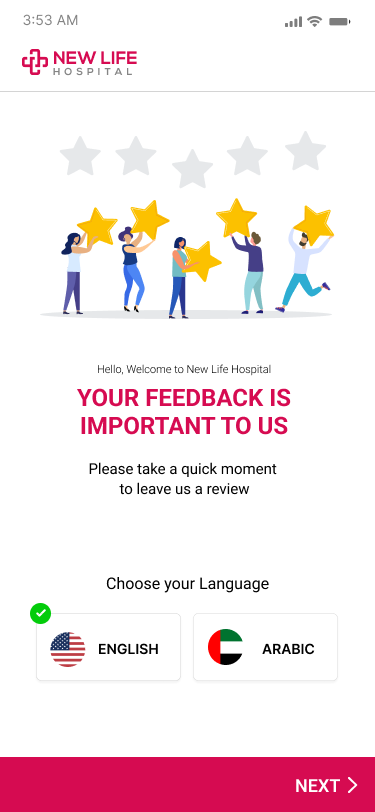
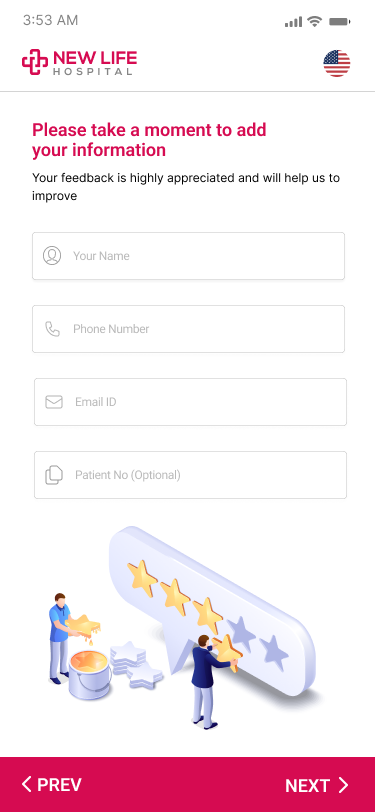
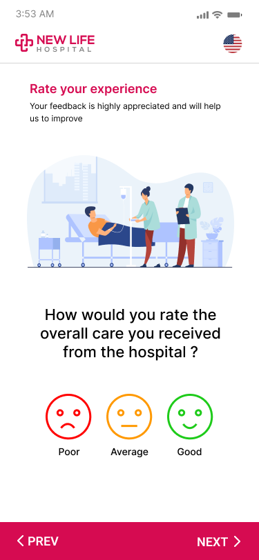
I conducted two rounds of usability studies. Findings from the first study helped guide the designs from wireframes to mockups. The second study used a high-fidelity prototype and revealed what aspects of the mockups needed refining.
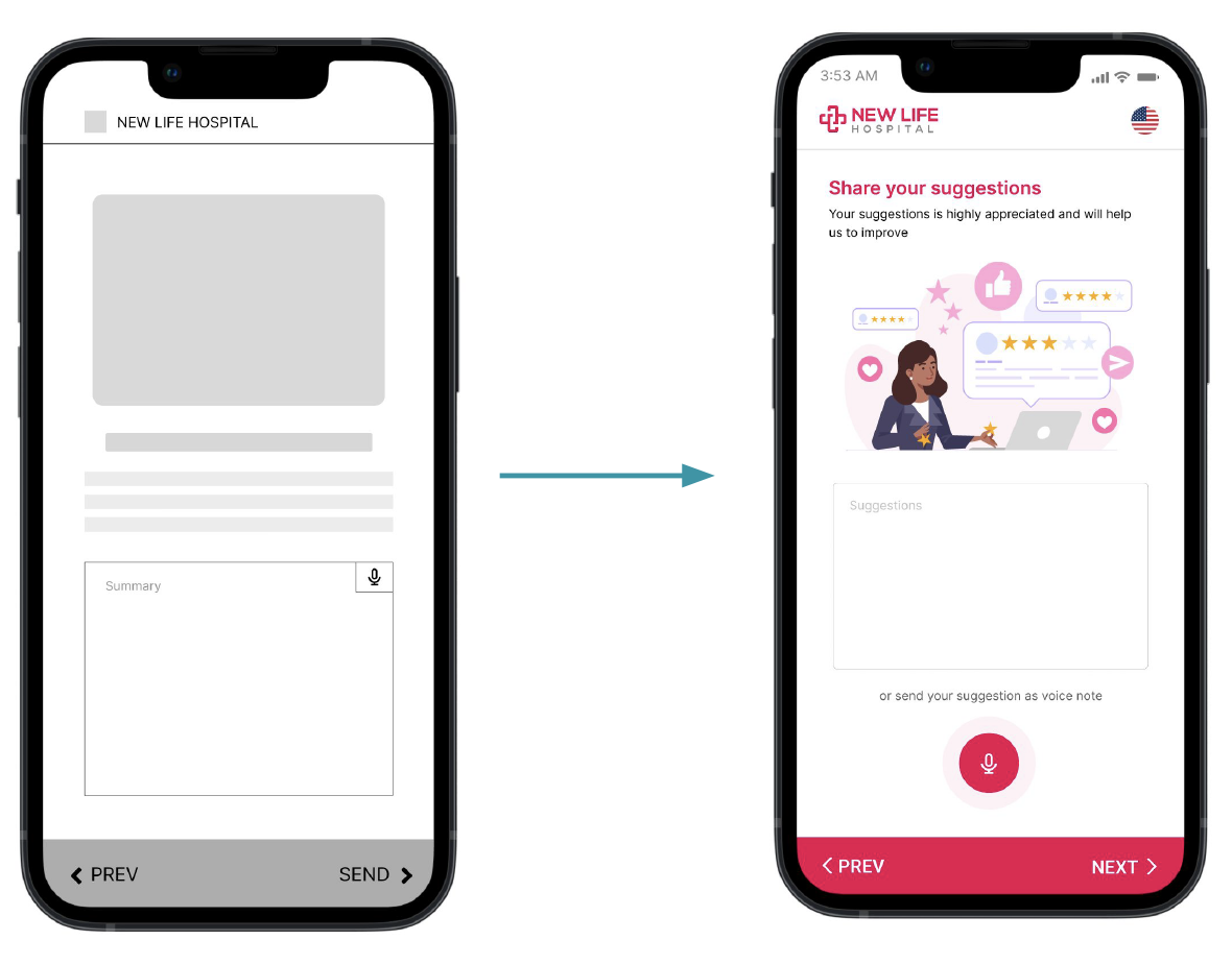
Mockup
What I learned ?
While designing the Hospital Feedback app, I learned that the first ideas for the app are only the beginning of the process. Usability studies and peer feedback influenced each iteration of the app’s designs.
What is Next?
- Conduct another round of usability studies to validate whether the pain points users experienced have been effectively addressed.
- Conduct more user research to determine any new areas of need.
